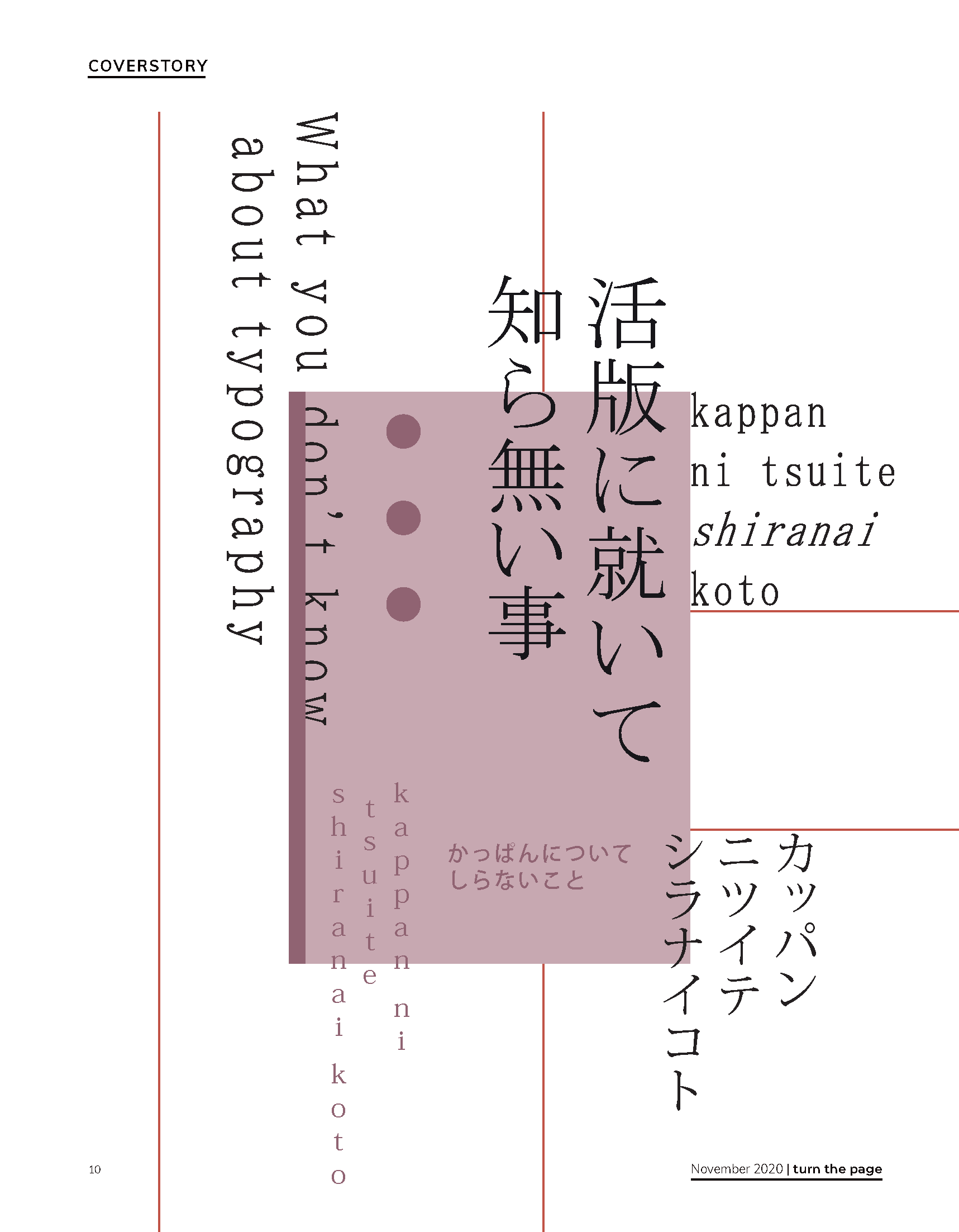
The way these words are printed on paper will most likely be taken for granted by many readers.
Even the people writing the words, letters and sentences, will often apply countless rules and principles without even being aware of it. But when you have to take into account the distance between the letters, lines and words all by yourself, this could be a substantial challenge. Choosing the perfect font requires paying attention to properties like serifs, cap heights and thickness. Even the choice for an ‘all caps’ font would be possible. Hence, finding the right balance is not always the easiest job. Now imagine you would have to pay attention to completely different facets. For example, if you worked with characters that were all shaped like squares. A lot of spacing rules could then be ignored and a whole new set of possibilities would arise. These characters could maybe allow you to put them all in a grid, or even to put whole blocks of text vertically without it looking unnatural.
by Stein van Veggel | special thanks to Marlies Peeters and Tienmin Liao
This is actually how a part of the Japanese script works. I am deliberately writing ‘a part of’, because the language actually works with four scripts simultaneously, and these can all be used in one single sentence. Every script serves its own ‘function’ in the language. The earlier mentioned box-shaped characters are called kanji characters, these were adopted from the traditional Chinese script and are mostly used for nouns. hiragana and katakana, two phonetic scripts, are used for grammatical endings and loan-words, respectively. Also, since Japan started interacting with Western cultures, even the Latin script is taught to Japanese children. This means that the Japanese language works with four coexisting scripts, each having another purpose. Still, almost every word can be written in all four scripts. This gives graphic designers a whole different set of possibilities and conventions as a starting point, which leads to other rules for layout and typography.
It makes you wonder: what is the strategy to design with this language? What kind of underlying rules have to be followed when putting something on paper? And besides, how would you integrate all scripts in one design without them conflicting? To investigate this, I approached two different experts, who both have a unique relationship with Japanese design. Marlies Peeters, who studied graphic design in Japan for two years, will tell us more about the underlying rules of designing with the Japanese script, mainly focusing on working with the kanji, katakana and Hiragana characters. Next, Tienmin Liao, typography expert from Taiwan, will elaborate more on how to find systematic design principles that can be applied to multiple scripts, to be able to let them all coexist in one design.
A complete explanation of how to design with these scripts, would unfortunately require more than the six pages available for this article. Simply too many aspects have to be taken into account. Besides, to be able to get a full understanding, one should dig deeper into the language itself first. The intention of this article, however, is not to provide a ‘user manual’. It is in fact about creating amazement in seeing how another ‘toolbox’ leads to new perspectives.
As I am having a coffee in Utrecht with Marlies Peeters, she enthusiastically tells me about her time in Japan. “I mainly focused on the different perceptions in the Netherlands and Japan of graphic design as a professional field.”. She briefly explains that the way the language is written, can already influence Japanese designs quite directly. “Japanese can be read both from left to right as from right to left, even vertically. This already influences, for instance, the way you open a book.”
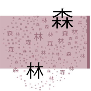
Making a forest with the kanji characters for ‘forest’ and ‘tree’
BUILDING BLOCKS
“During my time in Japan, I followed a course on typography, for which I translated my name to kanji, hiragana and katakana characters. This process of sketching, digitizing and printing them, taught me a great amount about their underlying structures and design principles You are actually dividing a square box in a different way every time, depending on the stroke shape and order. The stroke shapes and order you use, define the character.” She continues. “The building blocks, in a literal sense, of this language, create new challenges. Japanese designers tend to be extremely aware of the design area as a whole and how they can divide it. They make use of the block structure of Kanji by sometimes alternating between horizontal and vertical text blocks in the same design, resulting in a grid-like effect.”
Making use of the block structure of the kanji characters
DESIGN CHOICES
The choice to write something in another script can also have different effects. “Hiragana tends to come across as friendly and accessible, whereas katakana has a sharper aesthetic. Writing something in katakana can have a comparable effect to when we, users of the Latin script, write something out in capitals. It creates a certain emphasis. Even using the Latin alphabet is not uncommon. A designer can have many different reasons for using one script rather than another, even ones counter to the ones I just mentioned. But the fact that it is possible is remarkable to me, since we don’t have this possibility in the visual culture of our language.”
PLAYING WITH MEANING
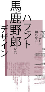
Marlies explains that, as every letter of our Latin alphabet solely contains an indication for a sound, a word’s meaning arises only after combining multiple letters. However, the components of which the Kanji characters consist can actually contain a meaning in itself. “These components are called radicals. For example, the Kanji character for ‘looking or seeing’ consists of the radical for ‘eye’ placed on top of the radical for ‘human legs’. The fact that the characters work in such a way, creates room for designers to apply typography in a more figurative sense.” She clarifies this by showing some pictures in which commonly used Japanese verbs are displayed. However, each time, one radical of the verb is replaced by a person portraying its meaning. “In this picture, the Japanese verb ‘kiku’, which means ‘hearing or listening’, is shown. Normally, this verb consists of the radical for ‘ear’ placed in between the radical for ‘gate’. Now, the ear component is replaced by a person that visualizes the definition. I really like the fact that this language provides these kinds of possibilities.”
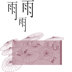
Playful use of the character for ‘rain’
Marlies concludes. “At a first glance, many people perceive written Japanese as chaotic or scribbly. But our own Latin characters come with challenges too. For example, the letter b shoots to the top of the line, the g shoots downwards, and the i is smaller than a w. We have overcome these challenges by creating rules that improve our script’s readability. Since working with Japanese, I started using these rules more consciously. For example, I became much more aware of how to use whitespace in my own designs. In a broad sense, I became more aware of conventions, and how to play with expectations within those conventions.”
SHIFTING OUR PERSPECTIVE
It can be a lot to take in. The direction in which we read, the amount of space we put in between words and letters and the way we deal with stylizing the letters. These conventions are often so inherited we don’t even consciously think about them anymore. After investigating a completely different script, we were able to take a step back and see the bigger picture. This leads to some interesting insights. The key message to remember is that the principles we apply in layout and typography, didn’t just pop out of nowhere. They actually originated from a language as a starting point.
Read Online
Note: this is a preview