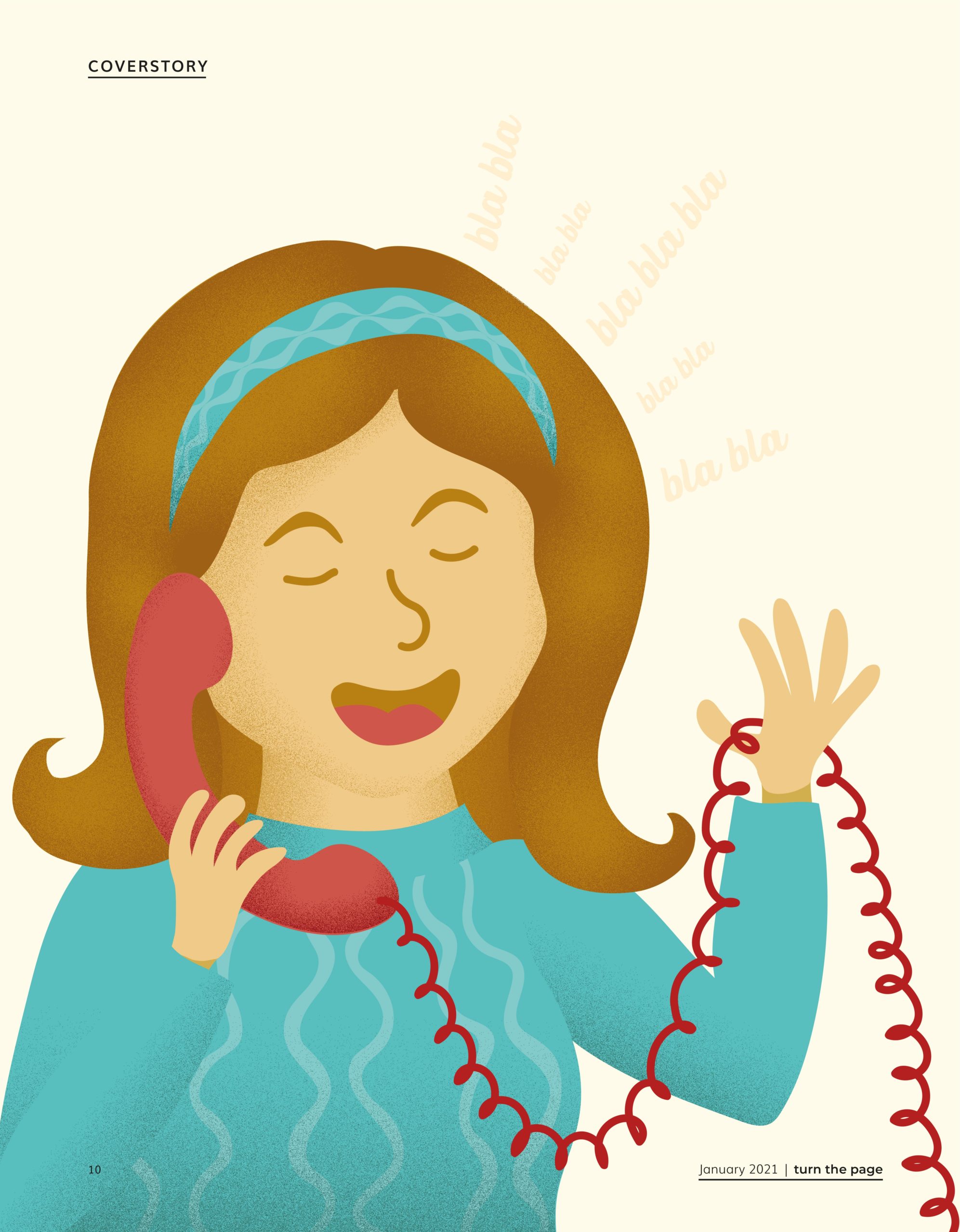
Quick, we are playing Charades! Act out that you are making a phone call.
What gesture did you make with your hand? Did you hold your pink to your mouth and your thumb to your ear, as an old time phone horn? Or did you hold your hand flat against your ear, as a smartphone? Most twenty to thirty year olds will remember the horn, but have we actually used it? Younger children, that grew up with tablets and smartphones, do not know any better and will never pretend to pick up the horn. Another example; say you are opening the window of a car. Did you push the window button, nice and easy? Or did you still roll the window down, turning the lever as fast as you could, as you probably remembered doing as a kid?
It is remarkable how these hand signals changed over time. Something that went without saying for one generation, leaves giant question marks for the next. This indicates a major gap in the way design is perceived. Some designs last, but others fade into oblivion. Some stay more or less the same and make a comeback, while others only cast a shadow of what they used to represent. Let’s explore the past by looking at designs of today.
by Liza Oomens and Megan Seker
RETRO IS ALWAYS IN FASHION
Mid-century modern cabinets, big light bulbs that look like incandescent bulbs, vintage-looking water cookers, bikes and record players. What all these products have in common, is that they appear to belong in a past decade. However, they are popular today. There is something about designs of the past that speaks to us.
Loving the aesthetic of a past decade is not just something of the last few years. In the seventies, the aesthetic of the fifties was popular, and in the past decade, the nineties have had a revival. It seems that the style that was popular when we were small children, is the style we want to re-explore now. Could this have something to do with associations with fond childhood memories, or do we romanticise a time we did not experience ourselves? Yet not all designs are this romanticised and some are tossed out as the way of thinking and living changed, only to make their reappearance later on.

BACK WHERE WE BEGAN
Design is a funny thing; in a way it strives for comfort and making lives easier, yet also pushes boundaries and likes to explore the unknown. Take for instance a corset; this undergarment was initially designed to make women well-shaped and look desirable in the most beautiful, extravagant dresses. But as the independence of women grew over the years, the corset was viewed more and more as a cage, rather than an upgrade to one’s appearances. The corset was tossed away, and women were proud to be unrestrained. As years passed by, the need to feel beautiful, curvy and feminine arose for some women and advertisement for corsets emerged again, only now to be called ‘shape-wear’.
The same funny reoccurrence happened with our phones. The first Nokia had the size of a brick and as technology improved these not-so-smart phones shrunk significantly. This was very convenient, since you could now be available anytime and anywhere. But technical development did not stand still, and phones became smarter and better equipped. To see the better pictures, apps or sites that were developed, a better and especially larger screen was deemed necessary. So basically, phones were huge, then shrunk, only to be enlarged again later on. When you think of it, it is quite amusing how our need to pursue and surpass trends as designers, also leads us back to where we came from.
ALTERNATING ATTITUDES
Not only products have evolved, but also the way we perceive and value them. If you would have asked people 40 years ago what they thought of a portable phone, they would answer that they did not see any need for it. We have a phone at home, who would want to be reachable every second of the day? Nowadays, it is impossible to imagine our ever online lives without our personal assistant in the pocket of our pants.
Speaking of pants, jeans have quite a history as well. They started as an essential for workmen and were later worn by rebellious members of counterculture. Jeans where introduced to the masses as casual wear, as seen on stars like James Dean in big Hollywood movies of the fifties. The first jeans only served practical use, they evolved into symbols of disobedience only to become fashion items in the end. Today, they have become mainstream and can be found in anyone’s closet.
Another interesting story is how cigarettes got adopted by women. Smoking thick cigars used to be the epitome of masculinity while it was socially unacceptable for women. Due to the changes in the social and economic status of women caused by The Great War and a PR campaign promoting cigarettes to women as fashionable ‘torches of freedom’, cigarettes became a new symbol of female emancipation. Now, knowing they cause damage to our lungs, they have become a little less appealing, although they are still integrated in society.

EVERLASTING ICONS
What about products that have disappeared? Some of them are in fact still here. We use them as symbols in everyday design. These icons aim to explain the use, or the goal of products and most people understand them immediately. They explain as much as possible, with as little as possible. But did you ever realise what these tiny images actually represent?
For instance, back in 1876, the first microphone was introduced. This was a wired device that conducted an electrical current as a means of transporting soundwaves. A technology which seems slightly ancient this day yet is still used to indicate the microphone on your earphones. Another example is the save-button on your Word documents. This tiny square cornered in your screen represents a so-called floppy. These floppies used to be the first flash drives ranging in a storing capacity from 800 kB to 2.5 MB, which is roughly the size of only forty images. We could not even imagine the use of a flash drive with that little capacity anymore. Yet nowadays, this image represents your nearly unlimited number of documents, essays, biographies and love poems.
THINK ABOUT IT
In a way, it is quite peculiar that these remnants of a digital past represent a part of our digital future. Icons of products that only our parents or even grandparents have used, mark the ever-changing field of design, yet our need to stick to the recognizable. Will our own grandchildren still use these icons? Or will they become abandoned, replaced by symbols of a new era?
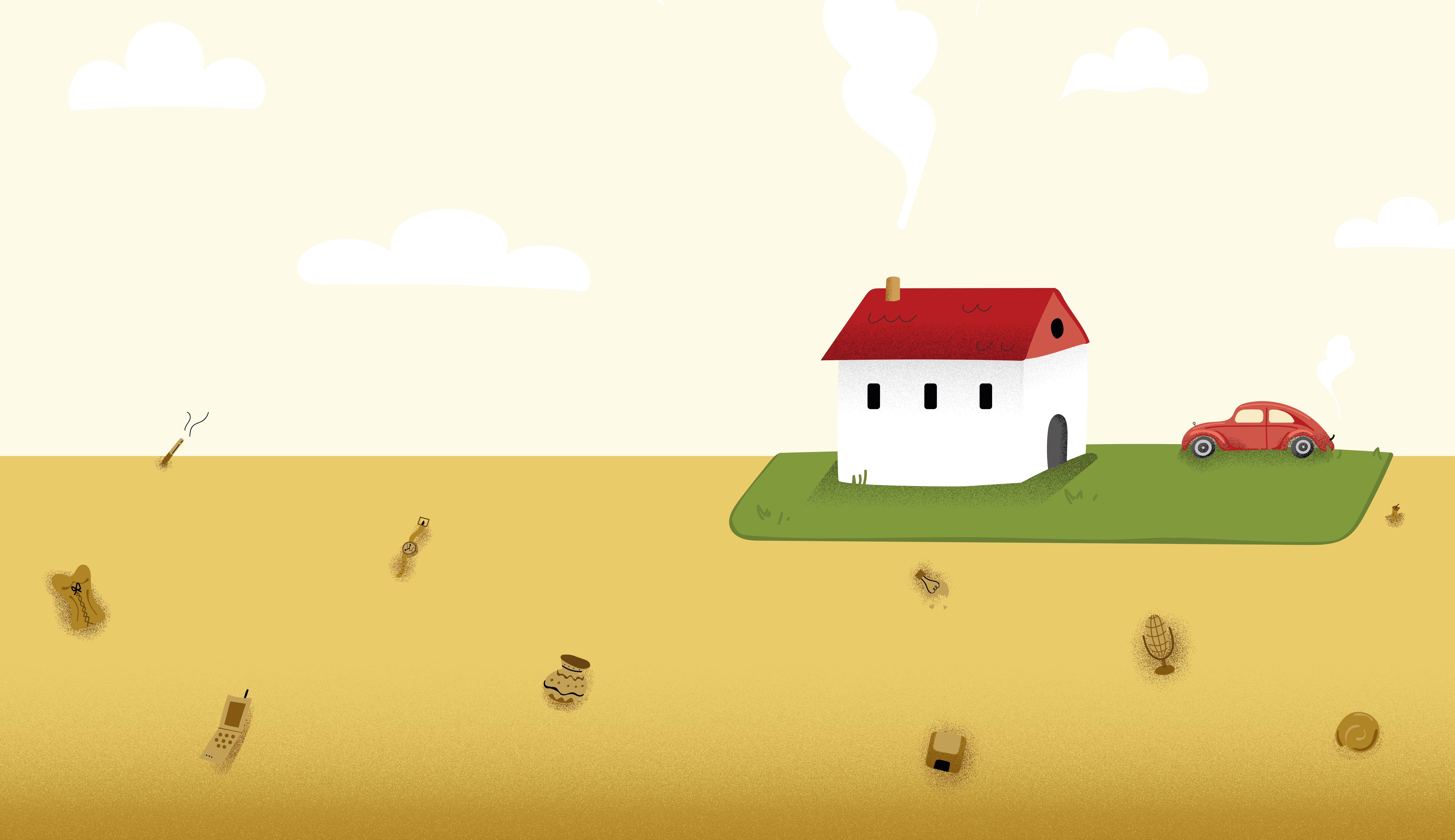
Change would not necessarily be a bad thing, but rather something to consider. We must stay critical on the roads we choose to walk on, yet also remember to look back every now and again, to see where it all began. Design is like the archaeological layers in the earth, where one significant development paves the road for its successor. The next time you look at a product, think about how its design is inextricably linked to its predecessors and the context it was made in.
Read Online
Note: this is a preview
